Having a gallery show helped me because it showed me what it
was like to be an actual artist, and what to expect in the real world. For
students who are trying to create their own portfolio I would suggest making sure
your theme is something you really like. Don’t spend all your time working on
something you hate because at the end you will still be unhappy. Also keep up
with your check points and don’t fall behind. It’s not worth the stress. Some positive
aspects of photography are the people in the class and learning how to use your
camera and how to take good photos in general. I’ve had several friends ask me
to take their senior photos for next year and it’s honestly because of this
class and what I’ve learned. I learned a
lot about what my strong points and weaknesses are from this class. I also
realized my love for photography. I was always into taking photos but now I
have a real connection. In my future life I’ll use certain skills that I
learned from this class, such as staying committed to something I started and
following deadlines. I really enjoyed this class.
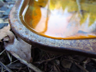
I have decided to do a concentration comparing decay in both man made and natural objects. Macro, texture, color, point of view, and contrast are all important principles of design in my photography to help express my overall theme of decay. The objects in my photography will be personally connected to me because I've grown up around both types of environment. My father is kind of a collector of rusted objects and I've always lived in areas surrounded by forest. I can't wait to get started.
Friday, June 7, 2013
Friday, April 5, 2013
Week 6
For
my concentration I wanted to show decay in both manmade and natural
objects. Growing up, I’ve lived in mostly forested areas, and my father is a
collector of machinery and old cars. Finding the decaying objects
would show the kinds of environments I was raised in. Some elements
of design I used were texture, and abstraction. I chose this
theme because I love the look of rusted objects.
My first two images are natural decaying
objects. In both images I contrast life and death, and I think this strengthens
my theme because of the emphasis on the death in both pictures. For example in
the second image of the decaying leaf there is a small plant growing through
the main leaf, showing life compared to death. In my next section I have seven
photos of decaying manmade objects. I use many different principles of design
in these images such as contrast, movement, rule of thirds, and point of view.
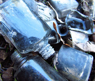
One of my strongest images in this section is the image of broken glass. I
edited this image's color in photoshop because I wanted to show beauty in decay. The next
section I finished off by creating several diptychs. I wanted to compare and
contrast the decay of both natural and manmade objects. The last image of the
rotting onion and the rusting spiral is really strong because each image has
the same composition, and the warm and cool colors help provide a bit of
contrast in the unity.
Friday, March 22, 2013
Week 5
This week I've been working on new diptychs and trying to decide which photos I will be using in my final concentration. I have quite lot of photos of rusted metal and I think I will spend next week collecting more photos of decaying nature to use so it will even everything out.
Friday, March 8, 2013
Week 3.5
It's the end of our third week and so far I've taken photos of both natural and man made decaying objects and happen to get some really nice shots. I chose these photos because they were high quality and fit my theme well. I've noticed that I'm working more with texture and I think I'm going to lean towards that in my final concentration. I've also created a couple diptychs and I think I'm going to create a few more for my final and maybe redue the ones I have now. When I redue them I'll add a black border because it'll make the diptychs look more professional. I think for the next few weeks I will be working more with editing then with taking photos.
Sunday, March 3, 2013
Week 3
I went outside while it was nice today and took several photos of both man made and natural decaying objects. I'm quite please with several of them, the lighting was lovely today. I'm hoping to have more days like this, this week.
Friday, March 1, 2013
Week 2
This week I worked on taking more photos of rusted and decaying objects. These objects turned out a little differently then last weeks because I was taking the photos on a sunnier day giving a red hue over almost everything. Comparing both this week and last weeks photos there is a high contrast of warm and cool colors and I'm kind of liking it. I've also decided to redue my theme. I think Im going to create a series of man vs nature dipdychs comparing decaying objects. My personal connection is that I will have grown up around both of these enviroments. I believe it should turn out intersting. This weekend I plan to get more shots of decaying nature and create the actual diptychs next week. We'll see how it goes.
Subscribe to:
Comments (Atom)


.JPG)


