This week I worked on taking more photos of rusted and decaying objects. These objects turned out a little differently then last weeks because I was taking the photos on a sunnier day giving a red hue over almost everything. Comparing both this week and last weeks photos there is a high contrast of warm and cool colors and I'm kind of liking it. I've also decided to redue my theme. I think Im going to create a series of man vs nature dipdychs comparing decaying objects. My personal connection is that I will have grown up around both of these enviroments. I believe it should turn out intersting. This weekend I plan to get more shots of decaying nature and create the actual diptychs next week. We'll see how it goes.


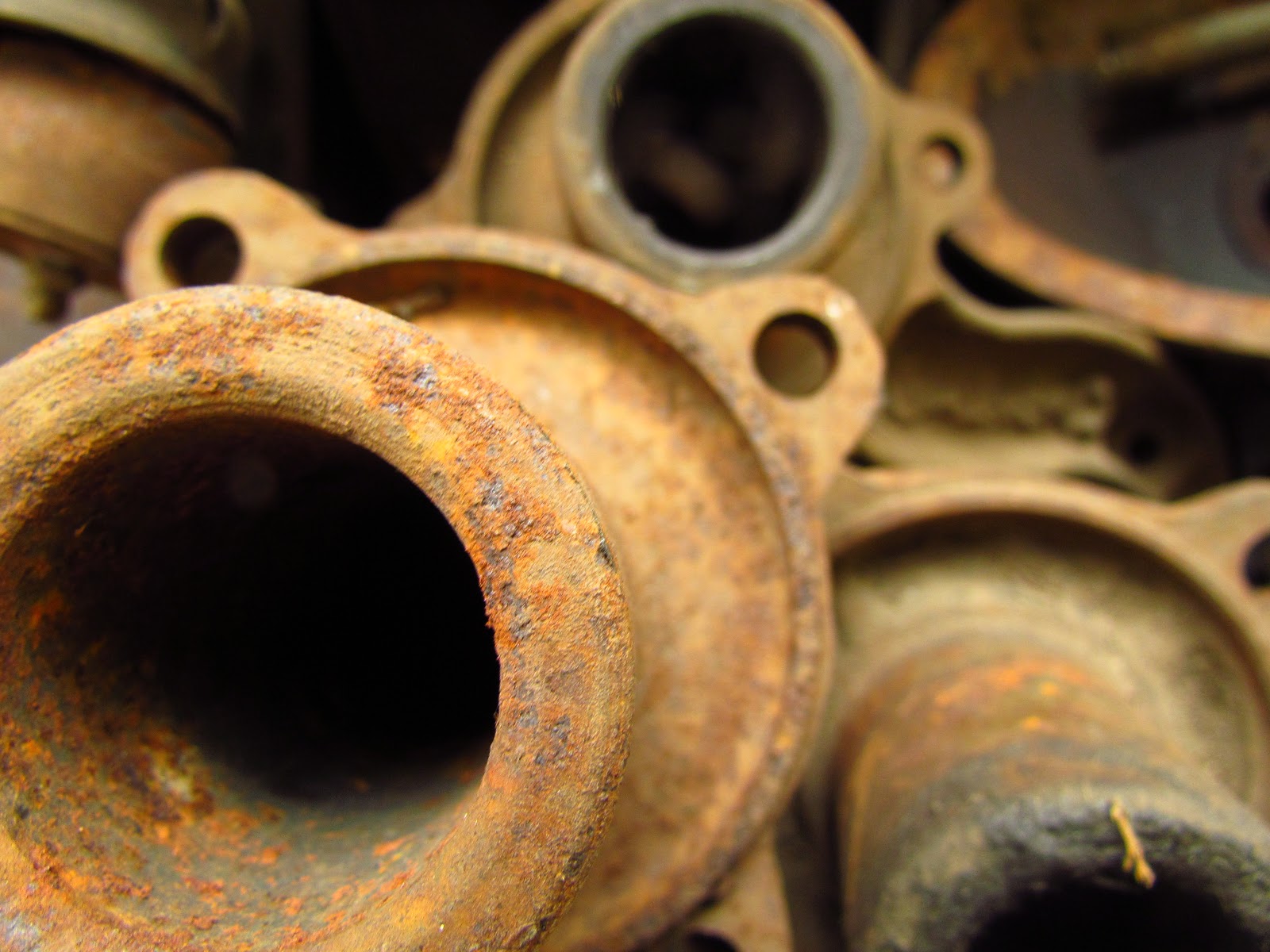


I really like this group of photos. I love how the rust completely contrasts the metal objects. the photos are also very clear and detailed.
ReplyDeleteI really like your images and the rustic look they give! These are a very awesome group of images and you’re very good at macro shots. The color and lighting really make the objects stand out to the viewer. You’re also very good at rule of thirds and that really shows in your images! Keep up the good work!
ReplyDeleteIt looks as though I could touch what's in the photos and feel the roughness of the objects, really good at getting the details to them along with the color of each rusting object
ReplyDelete